

According to G2, 38% of consumers will leave a website if they find the design unattractive. This highlights how crucial visual appeal is in capturing attention and shaping first impressions in today’s competitive digital landscape. One key element that plays a significant role in enhancing visual appeal is a gradient in design.
A gradient is a visual technique that blends two or more colors seamlessly to create smooth transitions. It can add depth, guide user focus, and strengthen visual hierarchy. Beyond aesthetics, gradients also serve as strategic tools for creating more engaging and dynamic layouts. This article further explores the power of gradient in design, including its various types and practical tips for crafting effective and visually compelling compositions.
Key takeaways:
- The main purpose of gradients is to add depth, guide attention, and improve visual hierarchy.
- Understanding different types of gradients helps you choose the right style for each design need.
- Using harmonious colors and controlled contrast is essential for creating smooth and professional gradients.
What Is the Purpose of Gradient?
In graphic design, gradients serve multiple purposes, functioning as powerful visual tools that enhance both the quality and effectiveness of a design. Here are the key purposes of using gradients.
- Create depth and realism by simulating light and shadow, making elements feel more dimensional and less flat.
- Guide user attention by highlighting important elements such as buttons or focal points.
- Enhance visual hierarchy by separating sections and emphasizing content priority.
- Improve aesthetics by adding richness and a more modern look compared to flat colors.
- Strengthen branding and emotional connection by expressing specific moods and creating a more recognizable visual impression.
- Make color palettes more engaging and visually dynamic.
- Simplify backgrounds by adding visual interest without the need for heavy images.
Also Read: Positive and Negative Space in Design with Examples
Types of Gradients
Each type of gradient offers a different visual effect and serves a specific purpose. Here are some of the most commonly used gradient styles in design, along with the effects they create and how they are typically used.
1. Linear Gradient

 Linear gradient | Source: www.geeksforgeeks.org
A linear gradient creates a smooth color transition along a straight line, which can be horizontal, vertical, or diagonal. It is the simplest and most widely used type, often applied to backgrounds, buttons, and overlays to create a clean and modern look.
2. Radial Gradient

 Radial gradient | Source: pinterest.com
A radial gradient spreads colors outward from a central point in a circular or elliptical shape. This type is commonly used to create spotlight effects or draw attention to specific elements within a layout.
3. Angular (Conic) Gradient

 Angular gradient | Source: pinterest.com
An angular gradient rotates colors around a central point, forming a circular transition. It is frequently used in charts, circular UI elements, or creative backgrounds to produce a more dynamic and visually engaging effect.
Also Read: 10 Graphic Design Principles: Must-Master Foundations in 2026
4. Mesh Gradient

 Mesh gradient | Source: ctfassets.net
A mesh gradient is a gradient that uses a grid of interconnected color points to create smooth and complex transitions. It offers precise control over color blending, allowing designers to shape highlights, shadows, and subtle variations. It’s exactly what you need when you’re working on high-end branding or layouts.
5. Diamond Gradient

 Diamond gradient | Source: www.photoshopessentials.com
A diamond gradient expands colors from the center in a diamond-shaped pattern, offering a unique variation of radial gradients. It is typically used in creative layouts or decorative backgrounds to add visual interest.
6. Freeform Gradient

 Freeform gradient | Source: pinterest.com
A freeform gradient allows designers to place color points freely, creating more organic and flexible transitions. This is suitable for experimental designs and artistic compositions that require a more fluid and natural look.
Also Read: 10+ Graphic Design Styles Every Designer Should Know
7. Reflected Gradient
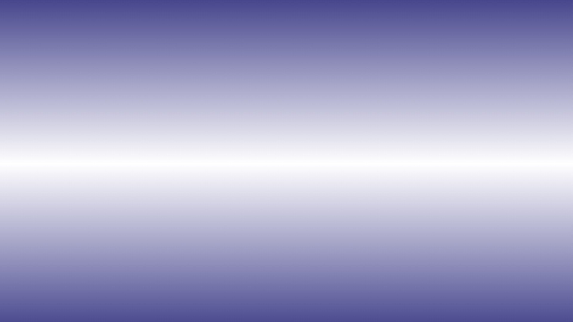
 Reflected gradient | Source: xmple.com
A reflected gradient is a color transition that mirrors itself from a central axis, creating a symmetrical effect on both sides. This type is commonly used to add balance, highlight central elements, or create sleek and futuristic visual compositions in backgrounds, UI elements, and digital artwork.
8. Multicolor Gradient

 Multicolor gradient | Source: pinterest.com
A multicolor gradient blends multiple colors within a single transition to create richer and more dynamic visual effects. This type of gradient is often used in modern and creative designs to add depth, enhance visual interest, and make layouts feel more vibrant and expressive.
Also Read: Environmental Graphic Design Explained with 10 Examples
Tips to Create Beautiful Gradients
Creating a beautiful gradient starts with choosing two or more colors that transition naturally and deciding the direction of the blend, such as horizontal, vertical, diagonal, or radial. The goal is to achieve smooth and balanced color transitions that support the overall design without distracting from other visual elements. Here are some practical tips to make your gradients look more refined and effective in design.
- Use harmonious colors that blend naturally, such as analogous hues to create smooth and pleasing transitions, and avoid clashing or overly saturated tones that can make designs look harsh and unprofessional.
- Control contrast carefully to ensure transitions feel smooth and not too sharp, as subtle gradients often look more modern and refined.
- Make sure gradients support readability by maintaining strong text contrast or adding shadows when needed.
- Experiment with different directions such as horizontal, vertical, or diagonal to influence layout flow and visual hierarchy.
- Add subtle texture or noise to reduce banding and make gradients appear more natural and polished.
Combining Gradients and Typography for Stronger Visual Impact
The power of gradient in design lies in its ability to transform simple layouts into visuals that feel more dynamic, immersive, and visually striking. By understanding the different types of gradients and applying them strategically, you can create designs that not only look modern but also communicate more effectively.
To elevate the impact even further, gradients need to be paired with the right typography. It is because the wrong font can easily get lost on a gradient background, while the right one will enhance clarity and strengthen visual hierarchy.
That’s where the gradient-friendly font collection from Get Studio comes in, a curated selection of over 100 high-quality fonts crafted to stay readable and visually balanced on complex backgrounds like gradients.